Wednesday, December 17, 2014

Web Page

          The scope of the web page project was to follow a step-by-step procedure and create a fun web page that would represent our schedule at ONW. The process to create this web page was a very long one. There were four part instructions that take you through the process specifically. From that you can add colors to add a nice contrast to it and then you are done! Something I learned through out this process was that you may mess up, but you can't get frustrated. Instead you have to be patient and go back a few step to see where you went wrong.
          Something I would do differently next time is taking the time to problem solve. This is so that I learn from my mistakes and don't repeat the same mistake again. I would keep the time it took to complete this whole project the same. This is because I finished it early without any errors made and it felt good to accomplish something on time. Something that I will draw from this experience to enhance my next project is keeping a steady pace. This project was really interesting for me because I liked how detailed the instructions were. It made things go more smoothly for me. 


House Animation

        The scope of this project was create a dream home that has a two bedroom layout with an overhang that expresses a unique style to the house.The process of this animation took several steps. The first step was to get a feel of how SketchUp works and from that start creating a basic design of a house. Then you start the actual creation and along the way you start editing it. Once you feel confident in how your house looks you're done! Something I learned along the way is that you need patience. Sometimes things won't turn out the way you want them to but with time you can figure out the solution to your problem.
        I wish I could have tried different styles of a house. This is because I felt like I didn't have enough time to make something creative and I thought that I would mess up a lot which could have resulted in me missing a deadline. Something I would have kept the same is the texture of the house. I really liked the color contrast of the house because it gave it a nice modern look. Something that I will draw from this experience to enhance my next project is the creative look of anything. It's ok to have a unique style as long as you have the major components. This was a really fun project because we got to express our creative ideas and go above and beyond with it.


Monday, November 17, 2014

The Twins

My keynote story is about one girl accidentally falling off of a dock and when she calls for help her twin sister that she doesn't know about comes and helps her. In the events of almost drowning both the twins are quite shocked at how alike they look. The twins make their way to camp and try to figure out the certain possibilities to being related. They find out that there birthdays are on the same day and soon realize they are sisters. Destiny had united the two sisters together after they were separated at birth.

Friday, November 7, 2014

Keynote

      My story is about a girl that falls off of a dock, but when she yells for help her twin sister that she doesn't know about comes and saves her. They try to figure out why they look so alike until they come to a conclusion that they are twin sisters separated at birth. A couple of keynote techniques that I used were duplicate selection. This lets you duplicate whatever you click on to make things faster so you don't have to start over again. I also used the grouping tool. This helped me group the body of my characters and group the text. 2 things that people liked from my animation were the color, and the plot of the story. 1 thing people said I needed to work on was making more slides to bring a greater affect to my animation which I improved on.


Wednesday, October 29, 2014

Story Board

So far in Animation we have learned about many different things but one the most important things we've learned about are Story Boards. A story board visually shows us an animation panel by panel, kinda like a comic book. Story Boards help you spread out your ideas so that if you need to make a switch in your animation you can.
 

Wednesday, October 8, 2014

Mrs. Lofquist is the best teacher ever!!!

Mrs. Lofquist is one of the best teachers I have ever had because she's really smart. She's also always there to help you out and she is really supportive. She knows a lot about all the programs on the computer and she is always teaching you new tricks on the computer to make your life easier! Overall she is a great teacher and everyone should have her as a teacher and love her!!! 

Photoshop and Illustrator


 I made my personal logo on Adobe Illustrator. Illustrator was personally my favorite because you could play around and make something real creative.

I made the ONW compass with Adobe Photoshop. In photoshop you have to know what your doing otherwise you will mess up and your picture won't look good and detailed.

I made my color wheel with Adobe  Illustrator. I really enjoyed this project because you could make the color wheel whatever design you wanted and the color adds a nice pop to it.

I made the monarch butterfly with Adobe Photoshop. With the butterfly you had to make sure the sides were symmetric and the colors were bright. The color process was just repeating.


Wednesday, October 1, 2014

ONW Compass


Photoshop is more different than Illustrator because in Photoshop you can adjust many different things like the brightness/contrast of a picture or the color balance of a picture, etc... Another thing that is different is that in Photoshop you have layers and in those layers you can open them and close them, or you can hide them while you are working with another layer. The 1st thing that I learned today was how to change the Image Size. Another thing that I learned was how to change the pixel size. The last thing I learned was how to create a new layer and name it! I learned a lot of things today but these were a few things that I learned! 


Tuesday, September 30, 2014

Orthogonal Cube


For the Orthogonal Cube project we went outside and used chalk to draw on the pavement for the e-Communiation campaign video. We collaborated with the e-comm animation class and created many great designs with the chalk and showed ONW spirit. The e-communication video class filmed us for the campaign video and overall we had a great time! It's really fun to collaborate with other focus areas because we can both combine our knowledge of design to create something big! 


Monday, September 29, 2014

Personal Logo


During the process of making my personal logo there were a lot of things that I had changed based off of my sketches to make it look more unique. My sketches were completely different than my actual logo because once I started playing around on illustrator I got some new ideas and created a brand new logo. I tried to make a logo that almost looked like the Target logo until a new idea sparked in my head. A couple of key items that I had changed were the shape, size, color, and font style. Something I changed about the shape of my logo were the ends of the stars. I didn't just want to make it a plain star with my initials in it but instead I just wanted to add my own "twist" to it. Another key item that I changed about my logo was the size of it. I didn't want the font on the inside of the star to come out of the star so I sized it to fit the shape of the star. During this designing process I could have picked any colors but the reason I picked this orange/yellow color was because it almost looked unique and not many people would use it. Last but not least of the designing process I picked the font for my initials. I designed to go with the font called "Zapfino." I really like the cursive detail of the font and thought it went well with my design. Overall I really liked this designing process to make my logo look more unique.


Wednesday, September 10, 2014

Color Analysis

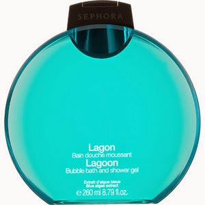
While I was comparing both of my shower gels I noticed that there were many differences in the variety of the color and the shape of the bottle. Both of the shower gels were used for the same purposes but the brands, and the audiences they were trying to attract were different. For the sephora shower gel there were a variety of scents to use and the shape of the gel was rounded and flat. They mostly used the color blue probably because it is considered beneficial to the mind and body. The audience they were trying to attract were older women because of the sophistication of the bottle. The Bath and Body Works shower gel was trying to attract teenage girls or young women. This is because of how the bottle is designed and the fragrance of the bottle.The color of the bottle was red, and it looked very emotionally intense and it symbolizes danger, power, strength, etc... The color wheel really helps you pick what color to choose for the bottles. You can learn a lot about different colors just by comparing and contrasting two bottles.


Tuesday, September 2, 2014

My Personality Type


The Humanmetrics Jung Typology Test is a 70 question test in which you are asked various questions that will identify your personality. I took this test and as a result I got 44% Extravert, 12% Sensing, 50% Feeling, and 33% Judging. My type is ESFJ. One of the celebrities I got that matched my results was Sam Walton who is the founder of Walmart. We are both strongly linked to the Compulsive Personality, and are somewhat linked to the Narcissistic and Dependent personalities. ESFG is more in common to women than men. We both are also concerned and supportive people persons who are often able to take the lead in social situations.

In my opinion my description is totally "right on." My description describes me very well because I am a very extravert person. I'm really outgoing and not that shy. I'm also not the type of person that judges people. My type description perfectly shows the type of person I am and compares me to another person that is like me as well.

My personality type description helps me better understand why I am the way I am because of the way I do things. I gravitate differently towards different things like work, play, activities, or other things because of my personality type. If I like to paint my personality type shows what color I would use. I could approach situations in a positive or negative way depending on my personality. Seeing how my personality is I feel like I better understand the type of person I am.

My personality type shows that I can work with a group and I can take charge in a social situation if i have too. This reminds of the celebrity I was compared too, Sam Walton. He is the type of person to take charge in a social situation. When the role you need matches up well with your personality type a lot of work can get done, especially when your working with a group. When your role doesn't match with your personality type no work gets done and everything works slow. In this situation other people will have to do the work for you.

In the past people some problems I have dealt with because of my personality is that because I'm an extravert person I don't get work done. People assume that since I'm an outgoing type of person I can't focus and don't get down to work. At this point in my life there is nobody that I "have issues" with. Everybody accepts me for who I am and I don't believe I have issues with anyone.


Thursday, August 21, 2014

What is Graphic Design?

Graphic Design is something we see in our everyday day life although we don't really notice it as much. We use graphic design in every human aspect of life. At your local restaurant, in the magazines you read, or even the classroom's you learn in everyday. Graphic Design combines art and technology to communicate ideas. It works with drawn, painted, photographed, or computer-generated images, etc... There is so much more to Graphic Design than we think there is. I'm so excited to start Graphic Designing to get my creative ideas flowing.