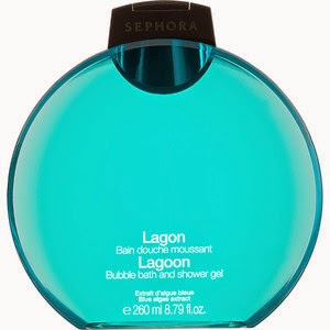
While I was comparing both of my shower gels I noticed that there were many differences in the variety of the color and the shape of the bottle. Both of the shower gels were used for the same purposes but the brands, and the audiences they were trying to attract were different. For the sephora shower gel there were a variety of scents to use and the shape of the gel was rounded and flat. They mostly used the color blue probably because it is considered beneficial to the mind and body. The audience they were trying to attract were older women because of the sophistication of the bottle. The Bath and Body Works shower gel was trying to attract teenage girls or young women. This is because of how the bottle is designed and the fragrance of the bottle.The color of the bottle was red, and it looked very emotionally intense and it symbolizes danger, power, strength, etc... The color wheel really helps you pick what color to choose for the bottles. You can learn a lot about different colors just by comparing and contrasting two bottles.


You have done an awesome job demonstrating your understanding of color in your blog! Let's work on these narrow margins ASAP :)
ReplyDelete