Tuesday, May 10, 2016
Monday, May 9, 2016
Movie Poster
We had to create a Saul Bass inspired poster for our Movie Poster project. Instead of Photoshop or Illustrator we had to use InDesign. This was such an interesting experience since I had never used InDesign before. I had some difficulty operating InDesign but once I practiced with it, it was so simple to use. I learned a lot about bleed lines and the different elements it takes in order to create a successful poster. Overall, this was such a fun project and seeing my poster printed out and finished was so worth all of the stress.
Individual Project
For my Individual Project I created Mug Coasters and a Baby Shower Card. My cousin created a baby shower card from a template online but wanted to add pink to the template since she doesn't know whether or not she's having a boy or a girl. I was really proud of my project since it took a while to create and color in. Next, I made Mug Coasters that I got inspiration from through artists, music artists, and myself. I got different pictures of Van Goghs art and made it into a clipping mask. I also got inspiration from Troye Sivan and made some of his singles into a mug coaster. I used the same font as his album and used the some colors from the art work to create this. The last mug coaster I created was with skin tones. I discovered this idea because I was searching for which skintone matched mine and that sparked this idea. Some obstacles I went through was making a clipping mask. I combined pictures with shapes which made my clipping mask disappear but I got overcame my obstacle by asking Ms. Lofquist for help and then it was really easy to make.

Friday, March 11, 2016
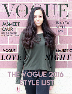
Magazine Cover
 My process for the Magazine Cover project included me going outside a taking a picture. Then, I had to edit the picture so that the saturations, etc... was correct. Then I added the heading and put it behind my head. I learned a lot about the different subheadings you need for a magazine cover and about color combinations. This was a fun and interesting project because I learned a lot about InDesign, fonts, and what it takes to make a good magazine cover.
Friday, February 19, 2016
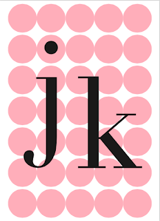
Final Business Card
My final business card was probably something that I was really proud of. I liked the color scheme and I really liked the simplicity of it. I included my logo on the back and all of my contact information that was needed. Making a clipping mask and making all the circle even was probably my biggest obstacle that I had to go through. Overall this was a fun project and all the hard work and effort that I had to put in was worth it in the end.
Tuesday, February 16, 2016
Music Video
Filming the Hotline Bling Music Video was probably one of the most exciting projects of the semester. Adam's dance moves were not that good but that's what made the video very intriguing to watch. I learned a lot about how to film different shots and how to direct.
Friday, December 18, 2015
Business and Postcards (FINAL)
Creating these business cards included me using many different types of tools like the Quick Selection tool and the pattern making option, etc... I was inspired by my passion for fashion and that is what drove me to make a vogue cover with a model on it. I have always wanted to create my own vogue cover and this was one of the best ways that I could create one. I had to use the quick selection tool to make the font go behind her head. I was really proud of this creation since it looked very professional and sleek. Then I made a circle pattern by using the Make Pattern tool. It took some time to create this since I had to make it perfectly aligned but it worked out very well.
Then I created my postcard which was inspired by a picture on tumblr that I found. I wanted to use warm colors for this to get a fall feel to it. I used a tight font to make it look more modern. To make the moon look good I had to use the minus front tool. I added my logo on each business card and I changed the colors for them to match the card. I also used the same logo font as Vogue did in order to get that professional look. Overall, this was a fun that helped my revise everything that I learned through out the entire semester.

Then I created my postcard which was inspired by a picture on tumblr that I found. I wanted to use warm colors for this to get a fall feel to it. I used a tight font to make it look more modern. To make the moon look good I had to use the minus front tool. I added my logo on each business card and I changed the colors for them to match the card. I also used the same logo font as Vogue did in order to get that professional look. Overall, this was a fun that helped my revise everything that I learned through out the entire semester.

Subscribe to:
Posts (Atom)


