For the Orthogonal Cube project we went outside and used chalk to draw on the pavement for the e-Communiation campaign video. We collaborated with the e-comm animation class and created many great designs with the chalk and showed ONW spirit. The e-communication video class filmed us for the campaign video and overall we had a great time! It's really fun to collaborate with other focus areas because we can both combine our knowledge of design to create something big!
Tuesday, September 30, 2014
Monday, September 29, 2014
Personal Logo
During the process of making my personal logo there were a lot of things that I had changed based off of my sketches to make it look more unique. My sketches were completely different than my actual logo because once I started playing around on illustrator I got some new ideas and created a brand new logo. I tried to make a logo that almost looked like the Target logo until a new idea sparked in my head. A couple of key items that I had changed were the shape, size, color, and font style. Something I changed about the shape of my logo were the ends of the stars. I didn't just want to make it a plain star with my initials in it but instead I just wanted to add my own "twist" to it. Another key item that I changed about my logo was the size of it. I didn't want the font on the inside of the star to come out of the star so I sized it to fit the shape of the star. During this designing process I could have picked any colors but the reason I picked this orange/yellow color was because it almost looked unique and not many people would use it. Last but not least of the designing process I picked the font for my initials. I designed to go with the font called "Zapfino." I really like the cursive detail of the font and thought it went well with my design. Overall I really liked this designing process to make my logo look more unique.
Wednesday, September 10, 2014
Color Analysis
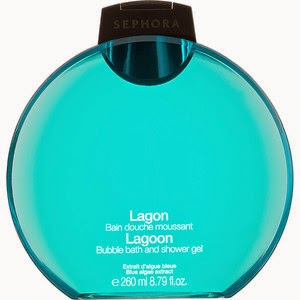
While I was comparing both of my shower gels I noticed that there were many differences in the variety of the color and the shape of the bottle. Both of the shower gels were used for the same purposes but the brands, and the audiences they were trying to attract were different. For the sephora shower gel there were a variety of scents to use and the shape of the gel was rounded and flat. They mostly used the color blue probably because it is considered beneficial to the mind and body. The audience they were trying to attract were older women because of the sophistication of the bottle. The Bath and Body Works shower gel was trying to attract teenage girls or young women. This is because of how the bottle is designed and the fragrance of the bottle.The color of the bottle was red, and it looked very emotionally intense and it symbolizes danger, power, strength, etc... The color wheel really helps you pick what color to choose for the bottles. You can learn a lot about different colors just by comparing and contrasting two bottles.
Tuesday, September 2, 2014
My Personality Type
The Humanmetrics Jung Typology Test is a 70 question test in which you are asked various questions that will identify your personality. I took this test and as a result I got 44% Extravert, 12% Sensing, 50% Feeling, and 33% Judging. My type is ESFJ. One of the celebrities I got that matched my results was Sam Walton who is the founder of Walmart. We are both strongly linked to the Compulsive Personality, and are somewhat linked to the Narcissistic and Dependent personalities. ESFG is more in common to women than men. We both are also concerned and supportive people persons who are often able to take the lead in social situations.
In my opinion my description is totally "right on." My description describes me very well because I am a very extravert person. I'm really outgoing and not that shy. I'm also not the type of person that judges people. My type description perfectly shows the type of person I am and compares me to another person that is like me as well.
My personality type description helps me better understand why I am the way I am because of the way I do things. I gravitate differently towards different things like work, play, activities, or other things because of my personality type. If I like to paint my personality type shows what color I would use. I could approach situations in a positive or negative way depending on my personality. Seeing how my personality is I feel like I better understand the type of person I am.
My personality type shows that I can work with a group and I can take charge in a social situation if i have too. This reminds of the celebrity I was compared too, Sam Walton. He is the type of person to take charge in a social situation. When the role you need matches up well with your personality type a lot of work can get done, especially when your working with a group. When your role doesn't match with your personality type no work gets done and everything works slow. In this situation other people will have to do the work for you.
In the past people some problems I have dealt with because of my personality is that because I'm an extravert person I don't get work done. People assume that since I'm an outgoing type of person I can't focus and don't get down to work. At this point in my life there is nobody that I "have issues" with. Everybody accepts me for who I am and I don't believe I have issues with anyone.
Subscribe to:
Comments (Atom)


